Combine 2013
Gabrielle Crevier, Leïla GateraProject Description
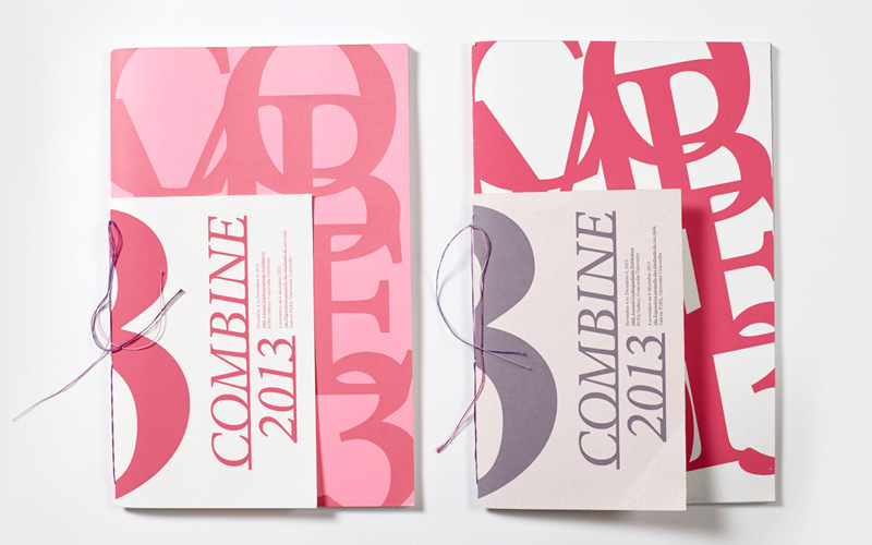
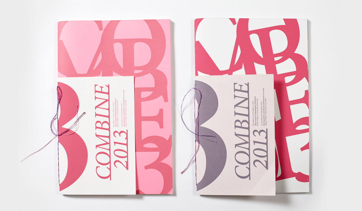
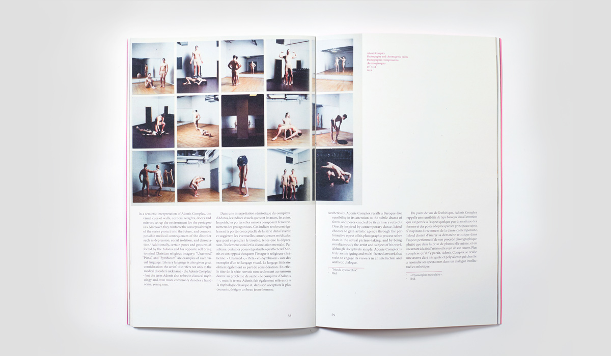
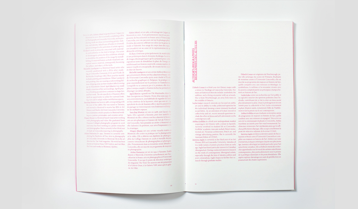
This group project was a competition where the designers had to create the catalogue for the 28th annual Faculty of Fine Arts exhibition for undergraduates. They came up with a layout that would distinguish and communicate each artist’s work successfully. The concept of the book was a reminder of the event’s content, pink being its predominant colour. The designers used a size for the catalogue that would be handy while exploring the exhibition. The cover size replicates the grid system used throughout the catalogue, which distinguished it from others. This project finished third place in the competition.


Go Back